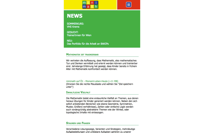
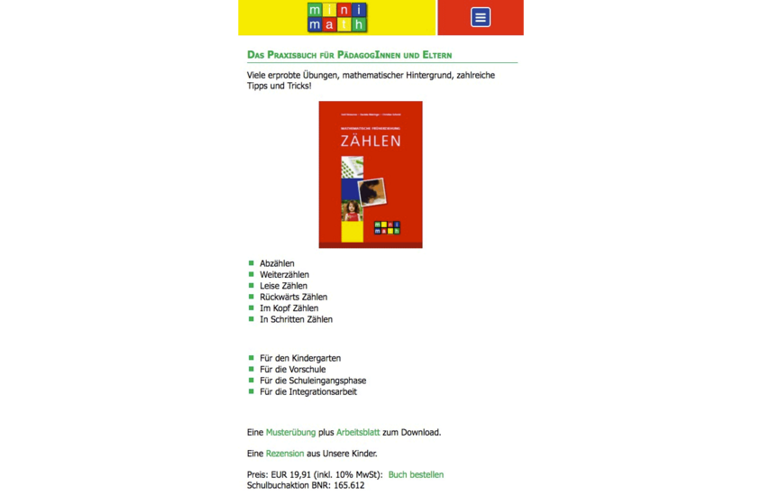
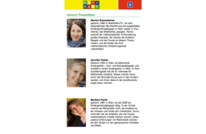
Minimath is a Vienna-based institute dedicated to early childhood mathematics education — running small-group courses for kindergarten and primary school children, training educators, and publishing their own teaching materials. When mobile traffic on their existing TYPO3 website began to climb noticeably, the question became: how does a small educational institute reach parents, kindergartens, and prospective trainers reliably, regardless of device? The answer wasn't a full rebuild — it was a responsive relaunch of the existing site.
- Responsive redesign of the TYPO3 website following a mobile-first approach
- Flexible layouts across all common screen sizes — from smartphones to desktop monitors
- Clean typography and legible font sizes on small displays
- Touch-optimised navigation for course listings, book orders, and trainer applications
- Structured content for three distinct audiences — parents, educators, and kindergartens — remaining clearly organised on every device
- Performance adjustments for faster loading on mobile connections
- Relaunch within the existing TYPO3 backend — no system change for the editorial team
After the relaunch, parents could browse Minimath course offerings from their phones without friction, kindergartens could reach the contact page without pinch-zooming, and prospective trainers could complete applications on mobile. Built with rockit, the responsive platform met the real-world browsing habits of Minimath's audiences — while keeping the editorial experience exactly as the small team knew it.